Justice League
DashboardSeptember 2026What if Manchester City lose points? Test deductions for every season since 2009/10.
Mapping English Devolution
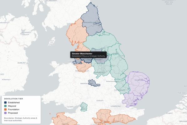 Research toolAugust 2026
Research site for LSE Growth Lab and LSE Cities. Map the powers of each strategic authority, compare local economies, and find areas that face similar challenges.
Tax Explorer
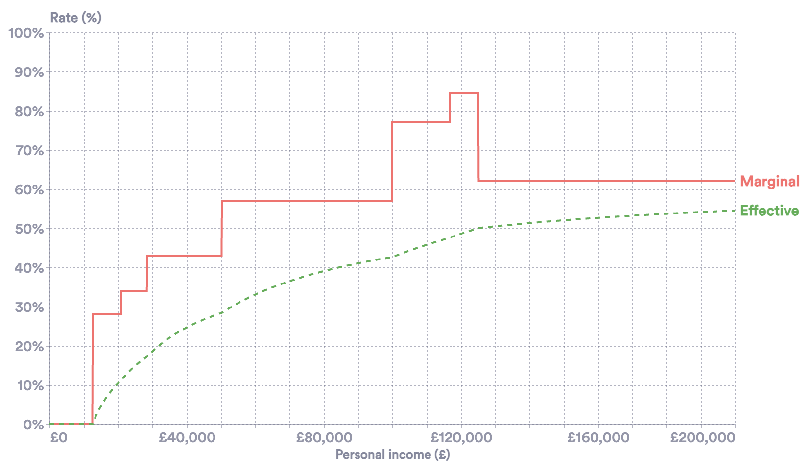 ToolSeptember 2025
Visualise your marginal tax rates. Under development
Britain's Trade Challenge
 PaperApril 2025
With Richard Davies, in the National Institute Economic Review. We trace the origin of 67,000 supermarket products to measure how trade barriers push up food prices.
ECO Semantic Search
ToolFebruary 2025Search every Economics Observatory article by meaning, not keywords, so editors can find old pieces to repost and cite. Built on OpenAI embeddings and Pinecone.
ECO Styles
PackageJanuary 2025Python package on PyPI that applies Economics Observatory house styles to Altair charts, with helpers for sources, recession shading and population data.
UK Dashboard
DashboardNovember 2024Live dashboard of UK economic indicators. Under development
Chart Tutorials: Vega-Lite
TeachingOctober 2024Growing collection of tutorials related to chart building using Vega-Lite. Under development
Map Data
DataSeptember 2024Boundary files for the UK, US and world, simplified and standardised as TopoJSON, ready to drop into Vega-Lite and Altair maps.
Data Visualisation Masterclass
TeachingJuly 2024One-day course for beginners, co-developed at the Economics Observatory. Five sessions take students from their first Vega-Lite chart to a live website of their own.
AutoCPI
 PaperMay 2024
Launch paper for AutoCPI, a daily scrape of UK supermarket prices. With Richard Davies and Finn McEvoy, we show how AI can make price data faster, bigger and cheaper.
21 charts for 21 countries
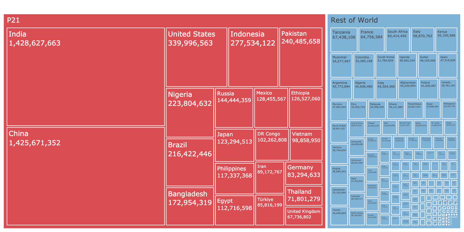 ChartsMay 2024
World's 21 most populous countries, compared through a series a charts on five economic topics. These charts were produced for LSE's Growth Day 2024.
Local Authority Debt
Data storyMay 2024Visualising the debt crisis across UK Local Authorities.
Economics for Everyone
ChartsMarch 2023Selection of charts produced for a new macroeconomics course at the University of Chicago.
London crime during the pandemic
 CourseworkJanuary 2023
Data analysis assignment for UoB software & programming module.
Housing
ChartsApril 2022Selection of charts on house building in the UK. Produced for the Economics Observatory.
Monetary Policy
ChartsApril 2022Selection of charts focusing on key economic indicators related to Unit 10 of the Core Econ textbook: Banks, Money and the Credit Market. Produced for the Economics Observatory.
Data Science: Project
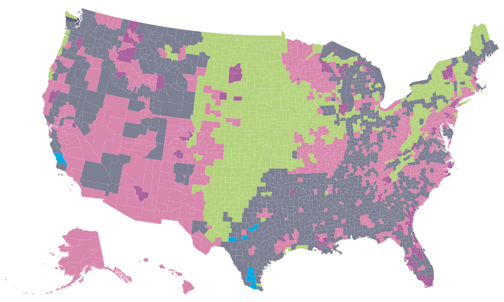 CourseworkJanuary 2022
Renewables and the potential for solar. The page holds a collection of charts produced for the Data Science course final project.
Data Science: Portfolio
CourseworkDecember 2021A collection of charts produced throughout the Data Science unit, part of the University of Bristol Economics course. Each chart demonstrates different data science and visualisation techniques.